|
"Clevedon - Seaside Treasures" Entry by Emily Charlotte Morán for Clevedon's Artist Of The Year 2024 competition. Visit Polodango between 26th July until 4th August to cast your vote!!  The Clevedon Artist of the Year competition returns in 2024, and this is my entry. I've blended my two distinct styles to craft an aesthetically pleasing pattern that showcases the treasures found in Clevedon, the gem of Somerset. My designs are consistently rich with various elements to spark curiosity, and this pattern is no exception. The more you explore it, the more you’ll discover. Among the iconic buildings and locations depicted, you'll also find the exquisite Somerset flower, the Cheddar Pink (Dianthus gratianopolitanus), nestled within. If you'd like to buy a cushion or tea towel featuring this pattern, click here or message me for something personalised.  Don't forget to visit Polodango between 26th July until 4th August to cast your vote. It will also give you a chance to see the piece and decide if you'd like to buy it.
0 Comments
The goal of this project was to create an illustrated map depicting the route taken by George Chaworth Muster, an ancestor of my client. My client retraced this route during a sabbatical and felt that including a clear, professional map in the published book would help readers better understand the journey.  Why employ me to illustrate your map?
Want to talk about your next project? Email me at [email protected]  Bespoke illustration of Alvony House care home in Clevedon, North Somerset. Alvony House is a charming Victorian building with modern amenities, situated in the heart of Clevedon in North Somerset. I was commissioned to illustrate the expansive grounds of the buildings, which span across two roads and feature an impressive ancient conifer tree at the centre. The client wanted to highlight some of the care home's amenities, such as the bus that is used for day trips, and its outdoor spaces. Given the distinctive architecture and the prominent conifer, I incorporated details that encourage viewers to continually explore the image. Creating intrigue adds significant impact to illustrations. With such an emotive subject, my artistic representations can evoke emotions and help potential residents feel more connected to the care home, making it easier for them to imagine living there. The nature of the way I produce images means they are versatile and can be used for so many more marketing materials, such as the way I transformed the original illustration into a bespoke Christmas card design too. See the bespoke Christmas Card design here:  Bespoke Christmas card design for the Alvony House care home in Clevedon, North Somerset. Check out my latest bespoke illustration - a stunning villa in sunny Spain. Bespoke illustrations make wonderful gifts, you can create a scene with elements a photo can't always capture.  This commission was for a stunning Villa in Sunny Spain. Capturing all the different areas of the house was tricky and required a bit of 'artistic licence' but creates a wonderful memory for the client especially with the addition of their four little dogs. The commission is a birthday gift and I sort out the printing and advise on frame size, colour and mounts - all delivered straight to your door. 
In March 2014, the British boyband One Direction — who Simon Cowell put together following their individual auditions for ITV’s The X Factor show — filmed the music video for hit single “You & I” at Clevedon Pier in North Somerset, England.
See some of my illustrations celebrating the massive moment for the town here:
One Direction At Clevedon Pier Poster
£20.00
A print celebrating the history of Clevedon Pier and Clevedon itself, and the memorable time that One Direction and its legions of fans descended to watch the filming of the music video "You & I." What is included: 1 x A4 poster AND FREE SHIPPING Upgrade the size to A3 or A2 and add personalisation too
Posted in cardboard tubes or large card-backed envelope. Larger sizes are available- just get in touch for prices. Clevedon Pier One Direction Jigsaw Puzzle
£46.00
The history of Clevedon Pier and Clevedon itself is brought to life in this colourful 1,000-piece jigsaw puzzle illustrated by Emily Charlotte Moran. See how many characters you can spot -- One Direction, Broadchurch stars Olivia Colman and David Tennant, street artist Banksy and more... FREE Delivery. Includes: 1,000 pieces Jigsaw size: 70 x 50 cm; box: 27 x 37 x 6 cm Recycled extra-strong card Made for Emily Charlotte Moran by Ravensburger, Europe’s leading jigsaw specialist These puzzles are made to order so please allow a little extra time if it is for a gift. Available for personalisation! Add your business or home as a marker to this fantastic gift for just £5 more.
When film crews initially turned up on the famous pier, crew members reportedly told people that BBC’s “Countryfile” was filming an episode there. Clevedon has had its fair share of film crews over the years (from Broadchurch to Sanditon too! ) so more filming vans on the seafront was nothing really new for residents.
There was a whisper of a rumor about One Direction being in town, but that was quickly put aside. Massive crowds gathered, though, after Harry Styles, Louis Tomlinson, Niall Horan, Zayn Malik and Liam Payne were spotted on the Grade I listed structure that Sir John Betjeman once described as "the most beautiful pier in England." The blustery weather didn’t stop local school children from skipping class to get a glimpse of the singers, who reportedly stayed at nearby Walton Castle.
After the Ben Winston-directed video was released, the pier immediately became a must-visit site for Directioners who would travel from far and wide to walk in the footsteps of the singers and touch and pose for photos with the plaque.
Where is the One Direction plaque on Clevedon Pier?
The plaque that the pier initially installed to remember the filming was moved to a bench near the pier entrance to keep an eye on after fans scrawled messages around it. “Coming to the pier and seeing the plaque has become something of a pilgrimage for fans. We have encountered problems with fans trying to graffiti and leave their own messages to the band since the plaque was installed,” ITV quoted then-Piermistress Linda Strong as saying at the time. All the plaques around that original plaque are now tributes to and from One Direction fans. The music video for "You & I" itself starts with Niall Horan leaving the Pagoda Cafe, walking down the steps and onto the main Pier itself. He then morphs into the other singers as they walk down the planks towards land. It ends with them all walking together, as I detail in my illustration.
See the video here:
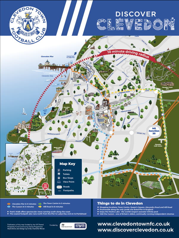
My latest commission was to create a beautiful illustration of the Alvony House residential care home in Clevedon, North Somerset. Initially, it presented a challenge because the home covers such a large area with three beautiful Victorian buildings joined together by modern structures and a huge protected conifer that is centre stage. And of course, there had to be something special added to the tree which highlighted what Alvony House was about: Care. The illustration will in future be tweaked for the company's Christmas card with a snow effect and decorations. Fancy something artistic and special for your business? Get in touch [email protected]  Bespoke illustration of Alvony House in Clevedon, North Somerset, by Emily Charlotte Moran.  Contact Emily Charlotte Moran on [email protected] for an illustration of your building, company and more. Custom illustrated maps are a great investment for yourself, company or organisation as they can be adapted in different ways and used on promotional material and more for years to come. As I design them digitally as vectors, once the initial eye-catching design is created it can be updated with more relevant details if and when required. The individual details in the map can also be taken out and used for other purposes (say, if I highlight a particular building or historic moment, it can then be used for letterheads, online, as cards and more). One example of this is the multiple ways in which I’ve repurposed this map design of Clevedon in North Somerset, England. The original map was commissioned by Discover Clevedon to be placed on boards throughout the town to inform locals and tourists of shopping areas, tourist attractions and other key amenities in a visually appealing way. It also sought to link the different areas of the town together. 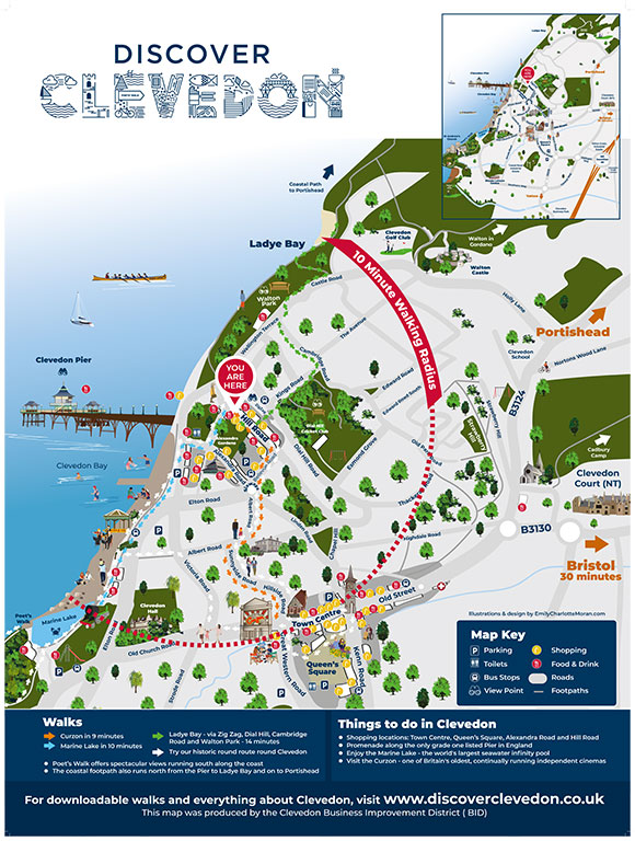 Illustrated map design by Emily Charlotte Moran. The maps were initially included on thousands of Discover Clevedon leaflets (which I also designed) that were distributed across the region, on map boards that were installed throughout the town and on informational boards that I also designed (featuring details of town’s history, geology and more) which are also in prominent places throughout the area. 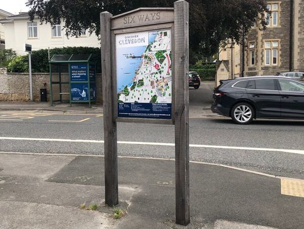 The illustrated map displayed on a board in Clevedon, North Somerset. Since that first design was created, I've adapted it for Clevedon Literary Festival and Clevedon Library. Clevedon Town Football Club also asked me to rework the map for an information board (which I also designed) that now takes pride of place outside the Seasiders' Everyone Active Stadium next to its new Heritage street art mural. 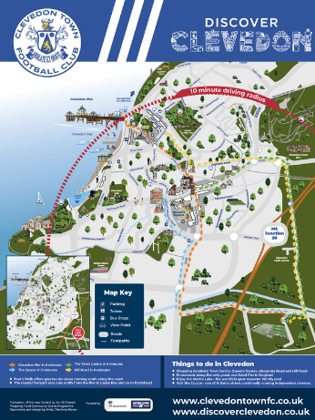 Bespoke map illustration for Clevedon Town Football Club. 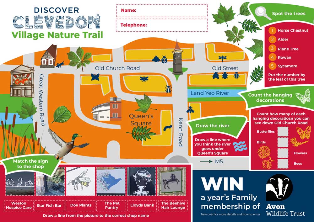 Educational materials design, seamlessly blending illustrations and graphic design. I've adapted the map to highlight several walking routes in Clevedon. The Clevedon Walks page on the Discover Clevedon website, where they feature, is its most popular: 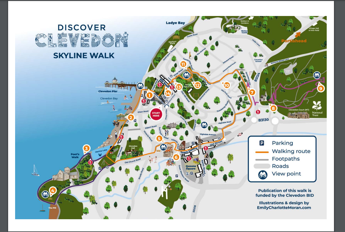 The Clevedon Walks page on the Discover Clevedon website is one of its most visited pages. I have also updated the map for a brochure to promote “The Hamptons” apartment development in the town. For this job, I was also commissioned to add in other relevant locations, including a bespoke illustration of the beautiful, historic building itself. See how my design blended seamlessly into the rest of the brochure here (on page 13): 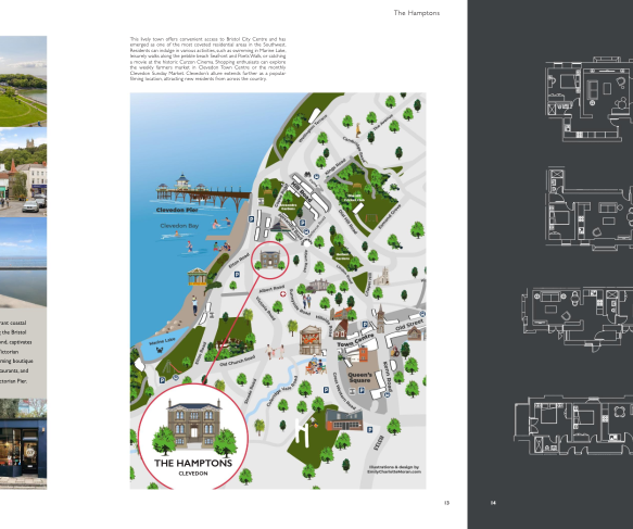 The illustrated map adapted for inclusion in the promotional brochure for "The Hamptons" development in Clevedon. As I explain in further detail on my custom map-making services page, my informative and fun maps can be created to cover a wide variety of places and events — from a personal gift or memento of a special occasion or moment to explaining places like heritage sites and museums, nature reserves, a directory of shops and restaurants, a navigational tool for university students on campuses, an educational tool for children, explaining retail parks, detailing music and sport festivals, family trails, walking routes and much more.
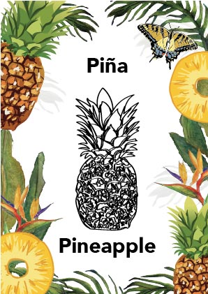
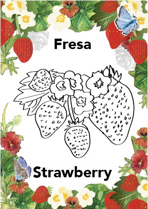
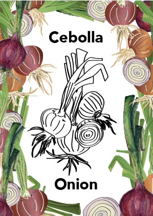
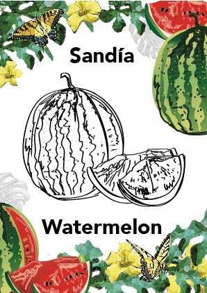
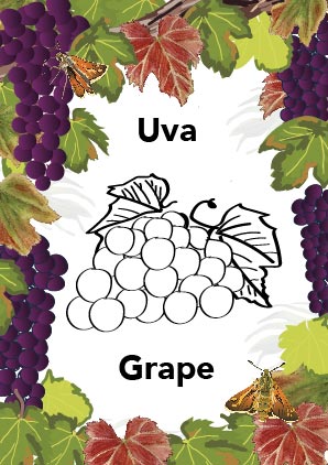
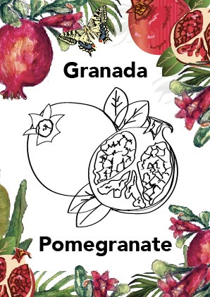
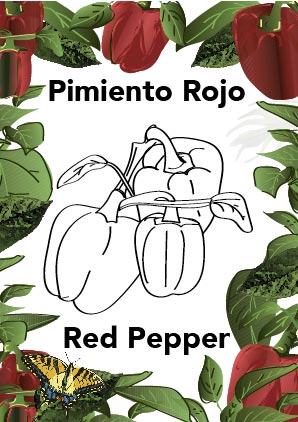
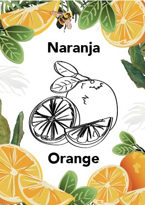
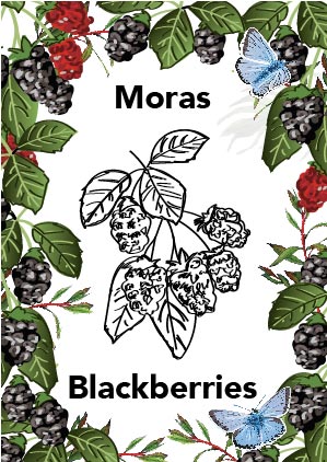
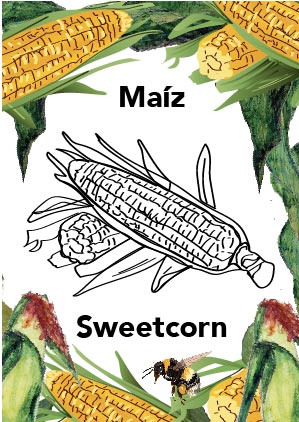
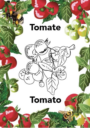
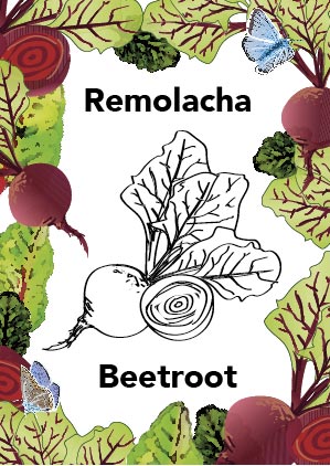
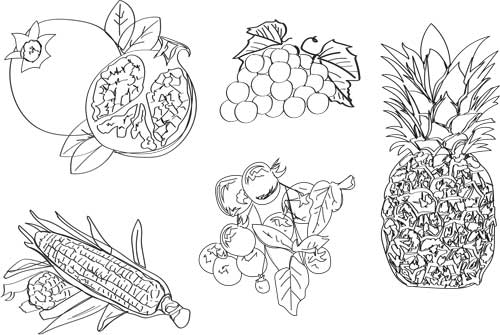
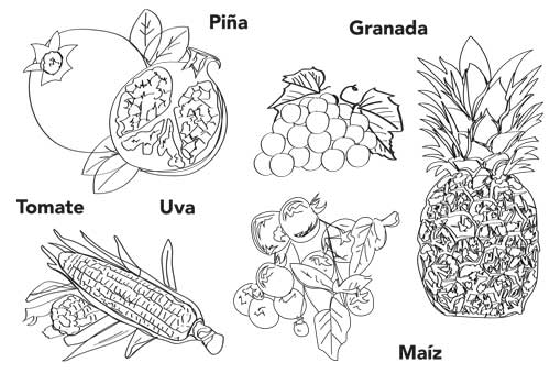
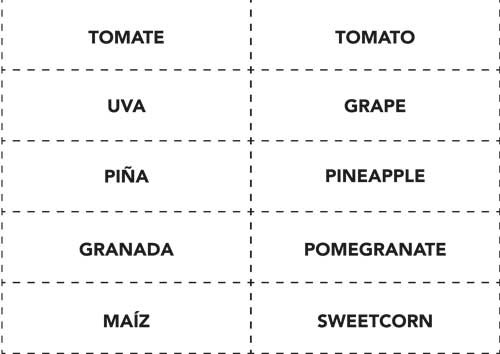
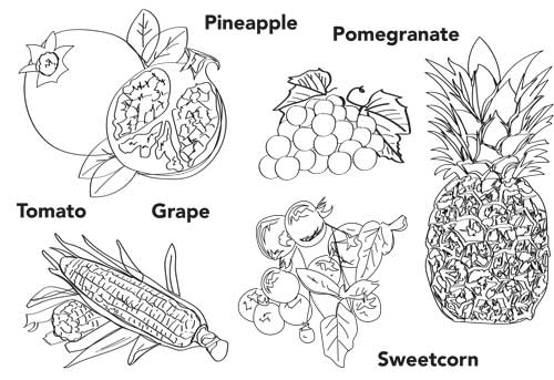
The maps can be as minimalist or as detailed as you like. Want to include some quirky details? Or do you just need them as a black and white map outline to form part of a book? No problem! And because I design them as vectors, they can be scaled up to billboard-size with no loss of quality. I can also adapt them to look great on social media platforms (such as Instagram, Facebook, X, Threads, LinkedIn, TikTok), for use on websites or as physical boards, in leaflets and brochures or books. Do you need a map illustrator for your project? Get in touch here. Learn Spanish words with this fruit and vegetables game. Designed for a class of primary school children aged 5 and 6. The brief was to create a fun and engaging game to help teach some basic Spanish words based on the term's theme of healthy eating. Children of this age are starting to read so producing something legible, using clear typography and sensible size text, would encourage the children to read both Spanish and English words confidently. The games followed a standard pack of cards style, consisting of 13 different types of fruit and vegetables repeated 4 times to give a pack of 52 cards. There were two possible games to play -- 'Snap' (sharing the cards between players and taking it in turns to put a card down, when the same card is placed the child can put there hand down on the pile while shouting 'SNAP' the winner has all the cards at the end); and 'Match the Card' by laying them face down on a flat surface and trying to locate pairs, the winner has the most pairs.
I was lucky enough to attend the class when they had this lesson and the children engaged with the game as well as learning the words in a different language, so much so that it naturally developed into naming the colours on the cards in Spanish and English too. The drawings of the fruits and vegetables are vectors which meant they could be transposed into the next games of cutting out and matching the names to the fruits or vegetables. The versatility of my illustrations means one project lead to many other possibilities. The flowers and foliage are made from watercolour drawings to provide interest and further exploration of the cards.
I seamlessly combined my vector illustrations, bespoke map design and graphic design skills to create informative A0-sized boards for Clevedon Town Football Club, who currently play in the Toolstation Western League Premier Division.
The boards are now proudly displayed on the wall at the Seasiders' Everyone Active Stadium (previously called the Hand Stadium) in Davis Lane, Clevedon, North Somerset. Do you want to display your football or sports club's history in an interesting, educational and stylish way? Get in touch to discuss via [email protected]
Download, print, cut out and play or colour in!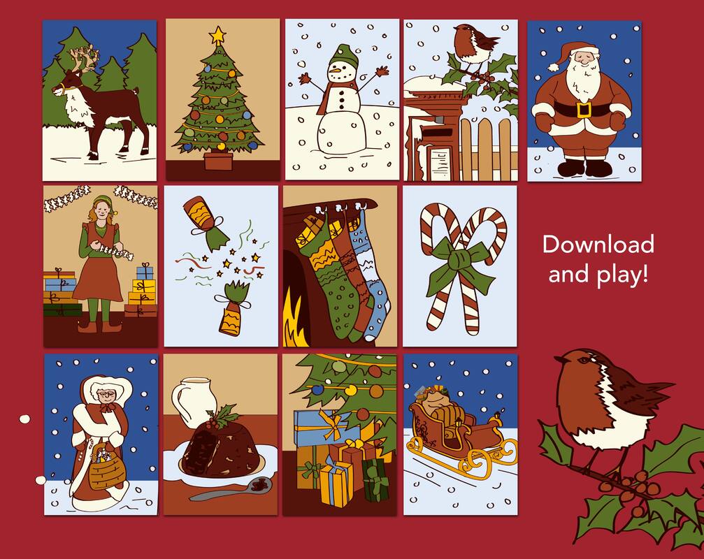 Christmas Snaps Game! Check out my 13 Christmas illustrations available as a downloadable game and colouring in. Print off, cut out and play... or print off and colour in... https://www.etsy.com/.../christmas-game-for-kids-download... This has been an absolute winner with my 5 year old daughter and a lovely way to spend quality time together when it gets dark so early. 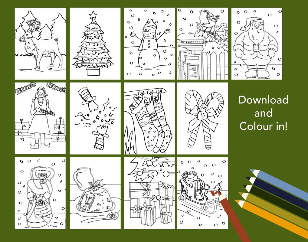 Instructions!For personal use only.
These Christmas snaps are perfect for entertaining little ones after school and spending a little quality fun time together. These are tried and tested on my 5 year old and make for a really nice activity that can get quite competitive. Instructions on how to make the pack of cards and play the games are listed below. This downloadable game and colouring activity is just a download, so no physical item will be sent to you. It is not for commercial use and the copyright remains with Somerset illustrator Emily Charlotte Moran after download, How to create your pack of cards. Download the pdfs, print the 4 pages of illustrations 4 times and cut out each card, this will give you 13 matching sets of 4 (52 cards in total). Use a nice thick card. How to play Christmas Snap.
How to play Christmas Match the Pairs.
The Clevedon Christmas Lights Switch-On 2023 hasn't taken place yet and there weren't many suitable photographs from a similar previous event. So, when I was commissioned to come up with a promotional poster for the start of the North Somerset town's Christmas festivities, I used my creative skills and imagination to bring the brief to life. As I'm a combined graphic designer-illustrator, I illustrated how the event could appear and then professionally laid it out. See the photos of the finished design below. Want to commission a promotional poster for your event? Contact me on [email protected] and sign up to my email newsletter here. I also sell various Clevedon designs as calendars, cards, prints, posters, jigsaw puzzles, tea towels and more on my Etsy shop here. 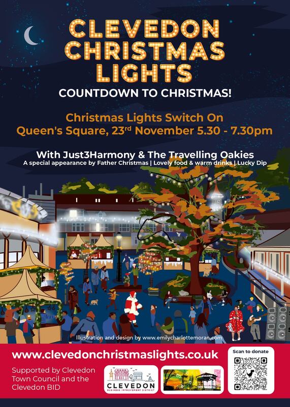 Poster design for Clevedon Christmas Lights 2023, created by Emily Charlotte Moran. 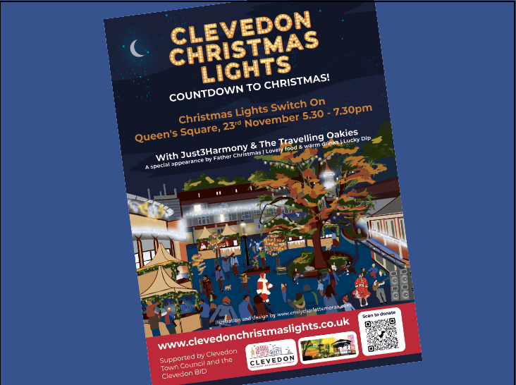 Just3Harmony, The Travelling Oakies and Father Christmas will all appear at Clevedon's Christmas Lights switch on in 2023. Say goodbye to lengthy email chains, multiple discussions and possible confusion when working with a separate graphic designer and illustrator on a project.
Instead, hire a combined graphic designer-illustrator (hello! that’s me, Emily Charlotte Moran!). Employing only one creative instead of two will save you money and ensure a consistent style across your project. I’ll also ensure every element of your project (from illustrations to page layouts) will harmonize seamlessly. You’ll also only have to communicate with one person, meaning that if you want to go in another direction, it’s much more easier to adapt. If you're interested in harnessing the benefits of my designer-illustrator services for your business, please get in touch on [email protected] I'm releasing my very first digital download just in time for the summer holidays. It's a series of three outlines of some of my artwork of Clevedon in north Somerset. It's a great children's activity, and comes recommended by my 5-year-old daughter who tested them out for me, and loved colouring them in. Clevedon Pier, Clevedon's Curzon Cinema, Clevedon town centre and the beautiful Dial Hill are all featured. Buy the product here from my Etsy shop for £2.39, download the PDFs when it tells you to and then print them off on your own printer. I also create other activity sheets for children. Want one for your own school, group or business? Email me on [email protected] for a chat. 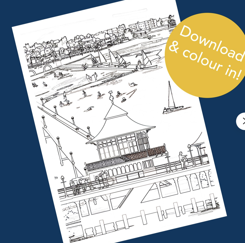 Clevedon children's activity sheets. Buy, download, print off and colour in. Designed by Somerset illustrator Emily Charlotte Moran. 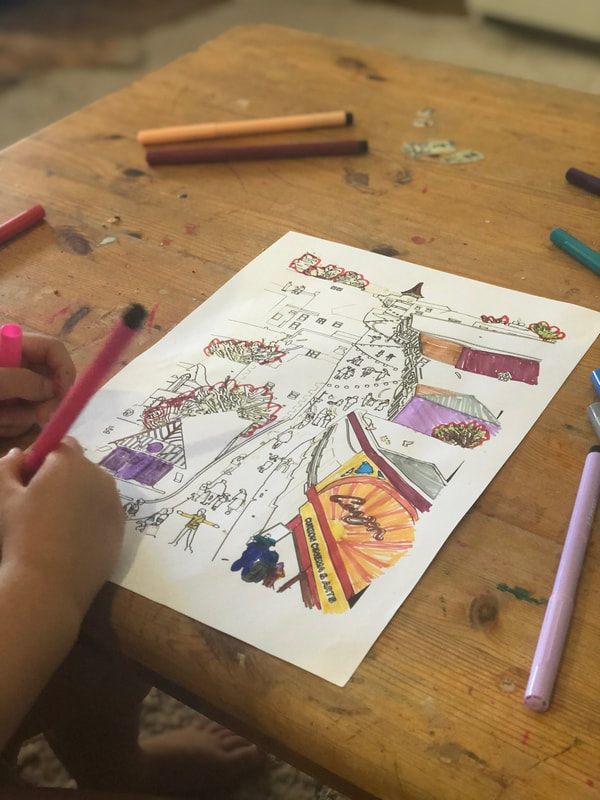 I was commissioned to come up with, design and create a local nature trail and educational activity sheet for children to use in Clevedon, North Somerset. See the finished "Village Nature Trail" for Discover Clevedon below. And get in touch if you'd like to talk about one for your own town, school or group!  Children's activity sheet, created by graphic designer Emily Charlotte Moran. 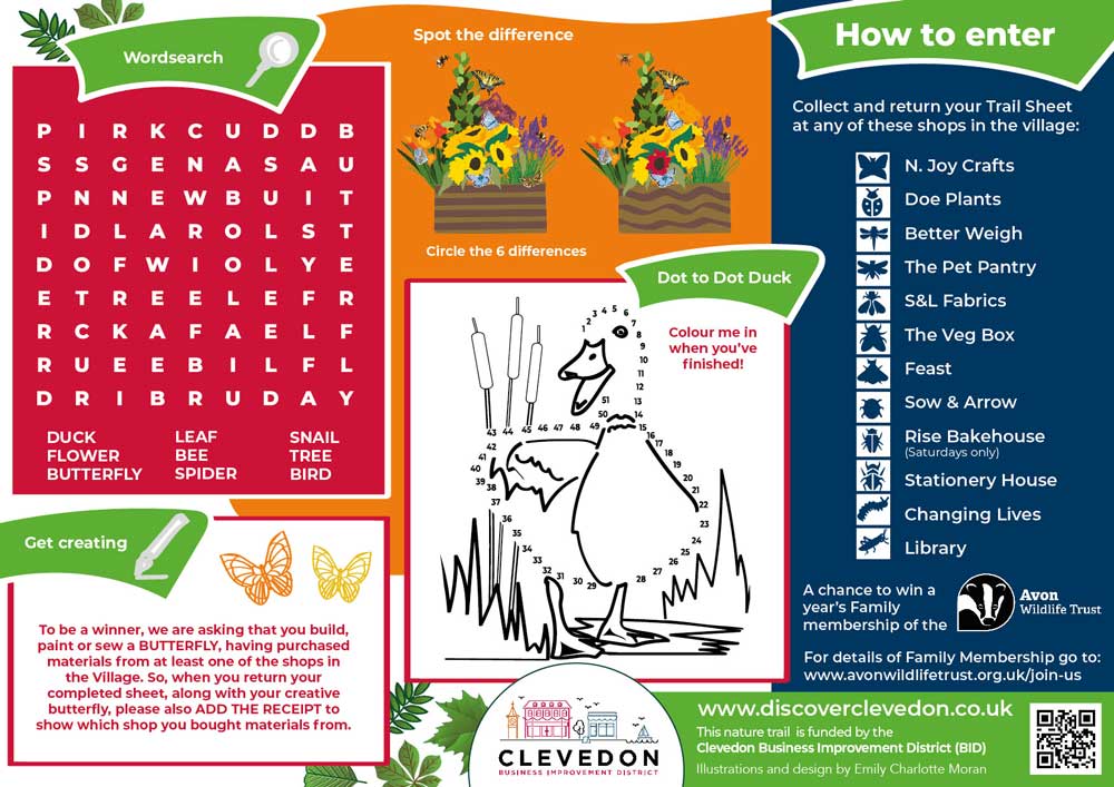 Interactive puzzle, learning and word search activity sheet, created by Emily Charlotte Moran. Illustration has a great impact on your promotional material, like this poster I was commissioned to create for the Dig For Victory Show 2023 which takes place this June at the North Somerset Showground in Wraxall. I also created the festival site map for the event, see below. Looking for a promotional poster for your event or business? Need a site map for your festival or show? Get in touch on emilycharlottemoran (@) outlook.com 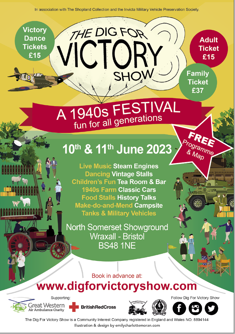 Dig For Victory Show 2023: Illustrated, promotional poster created by Emily Charlotte Moran 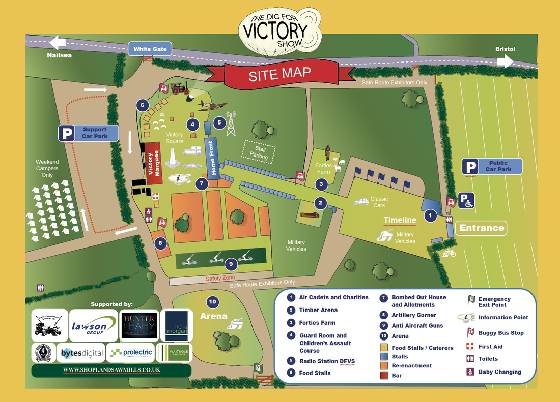 Dig For Victory Show 2023: Site map created by Emily Charlotte Moran |
I'm an illustrator, freelance graphic designer and artist with nearly 20 years experience of working on eye-catching tourism campaigns, multi-million pound bids, illustrated maps, company branding, personalised illustrations and more. Archives
June 2024
Categories
All
|
 RSS Feed
I would love to hear from you
TelephoneMobile: +44 (0) 7540236713
Office: +44 (0) 117 318 5499 Working hours - Monday to Friday 8am - 5pm
|
|
|
Copyright © 2013-2024 Emily Charlotte Moran. All rights reserved.